
Nano Banana 2.1 Got Better at Holding Still — Here Are the 11 Resources That Do the Rest
I once spent a Friday "fixing" a product shot by asking the model to change the background, the jacket color, remove the bin, and add a logo in one breath. What came back looked like the same product had been run over by a small, polite truck. The face was someone else's, the bin was still there, and the logo was spelling "BRNAD." That was the old world. The new world shipped on October 6, 2026, and it is called Nano Banana 2.1.
If you would rather not wire up API keys, thinking budgets, and a 14-reference fusion pipeline just to make one hero image, textideo pulls Nano Banana 2.1 in as a backend so you just prompt. But whether you call it raw or through a front door, the resources below are the difference between "I generated an image" and "I shipped a visual."
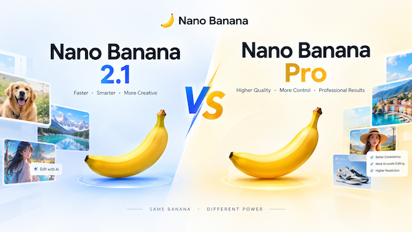
What Nano Banana 2.1 actually is (and the family you keep mixing up)
"Nano Banana" is Google's consumer name for the native image-generation models inside Gemini. The family is a small alphabet soup, and most people are using one without knowing which:
- Nano Banana — the original (Gemini 2.5 Flash Image). Legacy now.
- Nano Banana 2 — Gemini 3.1 Flash Image. The previous efficient workhorse.
- Nano Banana 2.1 —
gemini-nano-banana-2.1, the October 2026 update. Based on Gemini 3.6 Flash. Same Flash speed and cost, sharper output, better prompt adherence, and the production-grade editing leaps below. - Nano Banana Pro — Gemini 3 Pro Image. Slower, more deliberate; best for complex spatial scenes and precise brand consistency.
- Nano Banana 2 Lite —
gemini-3.1-flash-lite-image. Fastest and cheapest; skip it when you need multiple references or multi-turn editing. - Imagen — a separate, high-quality generation line. Different tool under the hood.
The honest one-line summary: 2.1 is the "Flash-class speed, but the editing and consistency got promoted from the Pro wing" release. Google's own side-by-side human evals (Elo) back that up — Infographic Design hits 1048 (2.1) vs 961 (2) vs 912 (Pro); multi-character consistency lands at 1106 vs 978 (2) vs 1011 (Pro). It is the version most new projects should default to.
The 11 resources
1. The "One Edit Per Message" discipline checklist
The prenup of AI editing — boring until the day it saves your background.
The single biggest cause of "the face quietly became a stranger's" is stacking three edits into one prompt. The model is good; your sentence is the problem.
The rule, copy-paste into your workflow:
Edit exactly ONE thing per message.
After the change, restate what must NOT move:
"Change the jacket to dark green. Do not change the face, hair, or background."
- Best for: any photo you intend to keep using.
- Who should grab it: everyone, including the person who just scrolled past it.
2. The 14-reference fusion recipe
A film crew that remembers every extra's face.
2.1 accepts up to 14 reference images — keep up to 4 characters consistent and 10 objects faithful in one scene. This is the feature that turns "a bunch of disconnected images" into a reusable asset library.
Prompt skeleton:
Compose a single scene using these references:
[ref 1-4] = the same person, different angles
[ref 5-14] = products/props to place
Keep character identity stable; keep each object's material and shape exact.
- Best for: e-commerce sets, character-driven stories, fashion lookbooks.
- Who should grab it: brands that shoot once and reuse forever.
3. The thinking-level dial
The difference between a quick sketch and a strategist who reads the brief twice.
2.1 lets you set thinking to minimal / medium (default) / high. Community testing shows that giving it a thinking budget tends to improve results on hard prompts — but the docs are vague on what it costs, and developers report the token accounting is not obvious. Use this as a default map:
| Task | Thinking |
|---|---|
| Quick ideation, single object | minimal |
| Most production edits, infographics | medium |
| Complex layout, spatial, multi-subject | high |
- Best for: deciding before you burn tokens you didn't mean to.
- Who should grab it: anyone watching a bill.
4. The wide/panoramic tiling-fix prompts
Ironing the seams out of a panorama.
2.1 fixes the tiling artifacts on extreme aspect ratios (1:4, 4:1, 1:8, 8:1) at 2K and 4K. If you make banners or panoramas, name the ratio explicitly so the model treats it as one continuous frame:
Generate a seamless 1:8 panorama (single continuous frame, no tiling seams):
[describe left-to-right scene]. Keep lighting continuous across the whole width.
- Best for: display banners, long-form hero strips, maps.
- Who should grab it: anyone who got "doorway in the middle of a field" before.
5. The in-image text & infographic template
A typographer who finally learned to spell.
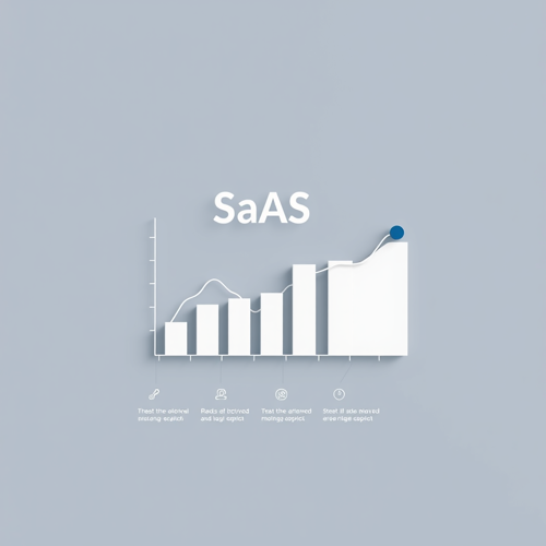
Text rendering and infographic layout accuracy are a headline upgrade. 2.1's Infographic Factuality AutoRater score jumped to 0.521 from 0.179 (2) — it now understands the content before laying it out.
Template:
Create a clean infographic on [topic].
- One clear heading, no more than 6 words
- 3 labeled data points, real numbers only
- Flat icons, generous whitespace, no decorative clutter
- All text must be legible and spelled correctly
- Best for: social stat cards, explainer graphics, ad creative.
- Who should grab it: marketers who used to retype the caption in Photoshop.
6. The cultural/regional accuracy add-on
The local who catches the cilantro in the ramen.
Across side-by-side testing, Gemini is repeatedly the model that handles kanji and cultural context without quietly westernizing everything (one competing model kept turning izakayas into teahouses). If you target non-English or non-Western markets, say so in the prompt:
Depict [scene] authentically for a [region] audience.
Use locally correct signage, objects, and cultural details. Do not default to Western styling.
- Best for: localized campaigns, regional product pages.
- Who should grab it: teams shipping outside the default-English bubble.
7. The model-selector decision matrix
A taxi dispatcher for your pixels.
Stop guessing which Banana to call. Route by constraint:
| If your job is… | Use |
|---|---|
| High-volume, speed/cost first, simple | Nano Banana 2 Lite |
| Default efficient work (editing, 1K–4K, consistency) | Nano Banana 2.1 |
| Complex spatial, precise brand, max world knowledge | Nano Banana Pro |
| Pure high-quality generation, no editing loop | Imagen |
- Best for: teams standardizing a pipeline.
- Who should grab it: leads tired of "why does this one look different."
8. The quota & rate-limit survival checklist
The fuel gauge nobody reads until the tank's empty.
One quiet trap: the daily Nano Banana 2 allowance and the "redo with Pro" allowance are linked. Burn through fast generations early and you lose the good ones later in the day.
- Track your daily count; reserve Pro redos for finals.
- Batch ideation on Lite, promote only winners to 2.1/Pro.
- Cache references so you don't re-upload 14 images per try.
- Best for: anyone on a plan with limits.
- Who should grab it: agencies running volume.
9. The mask/ink editing prompt set
A scalpel, not a sledgehammer.
Mask-based editing is where 2.1 earned its reputation (Mask/Ink Elo 1049 vs 965). The trick is to name the region and explicitly fence off everything else:
Using a mask, replace only the [object] on the left.
Fill the edited area to match surrounding [texture/lighting].
Leave the subject, pose, and background exactly as they are.
- Best for: object swaps, background replacement, restoration.
- Who should grab it: editors migrating off manual masking.
10. The consistency re-shoot loop
The continuity person on a movie set.
Even with 2.1's gains, identity can drift across many edits. When it does, re-anchor:
Re-shoot turn: keep [character/object] identical to reference image #1.
Correct only the drift; do not regenerate the whole frame.
- Best for: long campaigns, series, character arcs.
- Who should grab it: anyone publishing more than three images of the same subject.
11. The failure-mode cheat sheet (what 2.1 still can't do)
The friend who tells you the restaurant is closed before you drive there.
Trust is built by naming limits. From Google's own model card and launch coverage:
- Small text at 1K is still blurry — render text at 2K+.
- Long paragraphs / full-page text: limited.
- Input→output character consistency is not always stable.
- Mask/ink edits can still leave residual traces or execute incompletely.
- It can over-inherit the original pose/structure.
- Left/right spatial relations occasionally flip.
- World knowledge, advanced 3D reasoning, and factual accuracy are still improving.
- Best for: setting client expectations honestly.
- Who should grab it: you, before the revision round.
How to use these (the method underneath the templates)
Strip the theatrics and the real workflow is three moves: (1) name the style, lighting, and composition explicitly — vague prompts get generic results; (2) edit one thing per message and fence off what must not move; (3) re-anchor consistency from a single source reference whenever identity drifts. Everything above is a packaged version of those three habits. If you'd rather not assemble the pipeline yourself, that is exactly what a front door like textideo is for — Nano Banana 2.1 sits behind the prompt box so you skip the plumbing.
Tips to get more out of 2.1
- Start with a background swap. It is the easiest edit to judge, so you learn the model's "leave-the-rest-alone" behavior fast.
- Name the exact style. "85mm portrait photography" beats "a photo" every time.
- State lighting like a brief. "Golden hour, softbox, overcast" — one of those alone fixes most "flat" results.
- Promote, don't paddle. Ideate on Lite, finish on 2.1, reserve Pro for the genuinely hard spatial frame.
- Ground it. 2.1 can pull Google Web and Image Search to ground factual/educational visuals — use it for diagrams, not vibes.
How to choose (3 steps)
- Classify the job — ideation, editing, or complex generation?
- Match the constraint — speed/cost, consistency, or precision?
- Pick from the matrix in #7, then default to 2.1 unless a column forces Pro or Lite.
FAQ
Is Nano Banana 2.1 free?
It is available in the Gemini app and Google AI Studio with the standard free-tier limits; API usage is billed. Watch the linked NB2/Pro quota trap in #8.
Do I need the Pro version instead?
Only for complex spatial scenes, maximum world knowledge, or precise brand consistency. For most editing and 1K–4K production, 2.1 is the better default.
Why does my edited person look like a different person?
Almost always multi-edit prompts. Apply the "One Edit Per Message" checklist (#1) and the re-shoot loop (#10).
What does "thinking" cost?
Google's docs are vague; community testing suggests a budget can improve hard prompts. Treat high thinking as a "finals only" setting.
Remember the editing method with one word — E.D.I.T.:
Edit one thing · Describe what stays · Isolate with a mask · Test in turns (re-anchor). Say it out loud next time you're tempted to write a four-ask prompt.
The one thing to do next
Pick one resource above — the "One Edit Per Message" checklist is the highest-leverage — and run your next image through it. If you'd rather prompt than provision, open textideo and let Nano Banana 2.1 sit behind the box.
The model got better at holding still. The rest is still on you — one edit at a time.
Sources
-
Nano Banana 2.1 — Model Card (Google DeepMind) — official capabilities, eval methodology, and stated limitations.
-
Gemini Nano Banana 2.1 — API model page — model ID, token limits, thinking/grounding support, distribution.
-
Nano Banana image generation — docs — the full Nano Banana model family and when to use each.
-
How does thinking work in nano banana / gemini image models (Reddit) — community discussion on thinking budget and cost confusion.
-
Local image generation on Mac: 10 models compared (Reddit) — practitioner notes on cultural/regional accuracy and cloud vs local.
-
I hope the new Gemini will have improved image model (Reddit) — community naming/version confusion signal.
-
Control whether Gemini calls Imagen or Banana (Reddit) — routing confusion between Imagen and Nano Banana.
✏️Leave a Comment